Update on past WIP
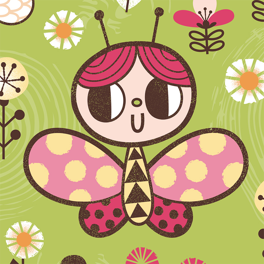
Remember this post? Well, I've been slowly working on it and wanted to post an updated version.

I decided I wanted a more "natural" color scheme so I went with warm tones, brown outlines and a green background. I may revisit my old color scheme later but I like how this is turning out.
I added some textures in Photoshop using elements I got in some Designcuts bundles I have purchased over the past year. They are superb by the way! I particularly am addicted to their font bundles!
Here are some other preview shots:


