Work in Progress - November 1, 2014
Hello all! I'm currently trying to add more pieces to my online portfolio. I'm really interested in surface design, whether it be for fabric, paper goods etc so I decided to create more pieces that have elements that can transfer to patterns. I took an old sketch (see this post) and decided I did not like the direction it was going in. So I decided to start from scratch and digitize straight from the sketch again. Here is the first version.

The first version has outlines. I do like the outlines because I feel that it really separates the bugs from the background but I'm not sure if I like how it's working with some of the textured elements. I will probably add more textures to it so if I'm not happy with the interaction right now, not sure if the problem will get worse later.... I'm not sure if the outlines make it look too "cartoony" or if that is a good thing. I guess I'm currently trying out different styles and techniques so I often feel insecure about my work. Although I love the images I create, I'm not sure if it's just my personal attachment to the pieces or if they really are appealing to other people.
This is the second version:
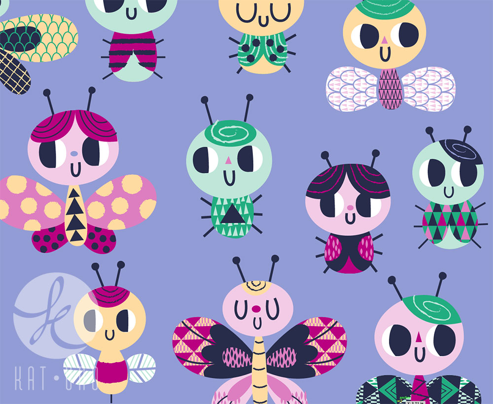
I like this one because it feels a little more fresh (not sure if that's the right term). I like how I was able to create negative space in some of the places (using the background color). One problem, again, is that this time I'm not sure it "pops" enough as in the outlined version. I think the textured areas integrate a little better though.
I do notice that in the second version the eyes do not pop out at me as much which bothers me for some reason. I guess I feel that eyes in general really have the ability to draw people in. Maybe I'll have to tweak the colors a little or try some different way to illustrate the eyes.
Either way, I like both versions and will probably work on both to see which one is more successful come completion. I just enjoy working on the icons. It's so fun creating the little pockets of patterns and then adding the textured strokes on other areas. I love Illustrator because you can create very graphic pieces like this one and also much more illustrative work like this.

