Rebranding - My Approach
A Painless Facelift
I had my previous logo since 2013. I'll be the first person to admit I'm not branding expert so as I look at it now, I really can see how little it represented me as a brand.
Essentially it was a stylized "K" in a circle. Yup, that was my thinking behind my logo. Then I added a hand drawn (then cleaned up in Illustrator) word mark with my name. BTW, I'm not a great hand-letterer so you can see it wasgreat idea upon great idea LOL.
I was fairly satisfied with this logo for the past three years mainly because my freelance work and business was a side job and I didn't have the time to fully invest in a whole rebrand.
This past week I sat down and really thought about my business. I officially started pursuing my creative career in full force at the beginning of last March. I resigned from my 5 year full-time secure job and took a leap. I was running at full speed for the past year and I've finally come to the point where I have some breathing room to focus on what exactly I want my business to be and become.
I spent the past year researching different areas I could pursue with my illustration and although I'm inspired by so many different types of art (realistic, animation, textiles) my passion is rooted in cute and pretty. I decided I want to build my brand around this specialty.
Rebranding and Restructuring
So back to the rebrand! Ok so I started doing research on what involves branding. I in no way want to discount branding just because I've decided to do it myself. It is so important for a business/brand to get it right. Here is a wonderful article by Elle & Co. about what branding is:
Why Branding Matters - Elle & Co.
Essentially your brand is your business' first visual impression to the world. Ideally your branding should visually convey who you are and/or what your business is about. Sounds complicated and a little nerve-wracking? Oh, yeah!
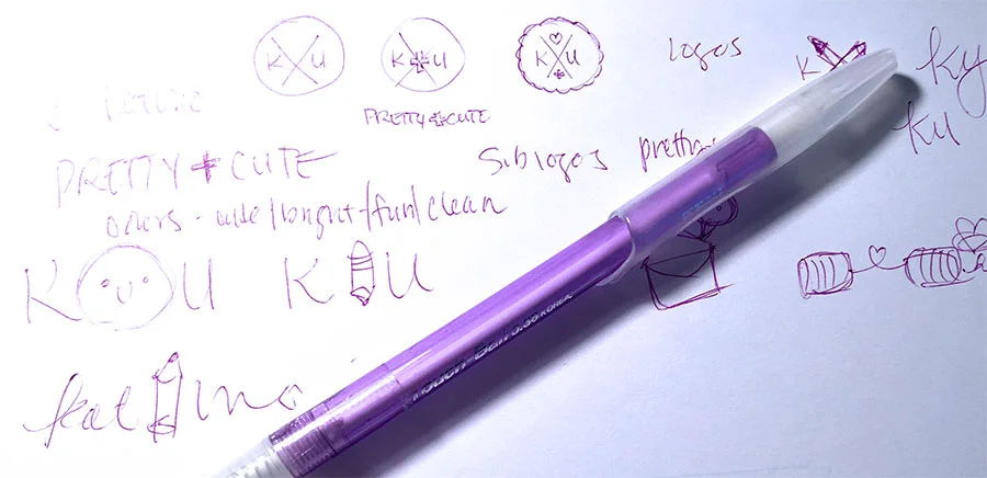
So going back to my original logo and branding, it really speaks nothing to what I do, nothing. I went to my sketch book and started jotting down ideas of what I felt I needed to convey.
Some of the key takeaways I wanted my brand to instantly communicate were:
friendly and fun illustration
both digital and hand drawn
unisex but skewed more towards feminine
clean and polished products
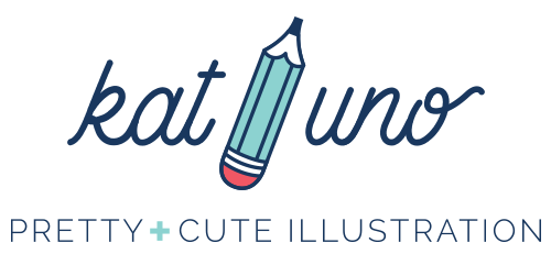
My initial ideas were incorporating my name and some kind of icon/illustration that hinted at what my business was about. I chose a pencil icon since it can symbolize both illustration and the hand drawn aspect. I illustrated the pencil to be shorter, chubbier and hopefully cuter.
I chose a clean and cute script font for my word mark that was easy to read, clean and cute along with a simple sans-serif for the tagline.
Finally I added my tagline "PRETTY+CUTE ILLUSTRATION" because that is what I specialize in. Whether it's pretty and cute or "pretty cute" illustration, I wanted to be very clear that's what I do.
When it came to choosing a color palette, I wanted one that didn't skew too feminine or masculine. I also wanted a mix that was fun and friendly. Here are the colors I chose, a mix of warm, cool and neutral hues:
My Final Logo
Here is my final logo:
I'm really happy with how it turned out. I feel that it speaks more to what I do and hopefully potential clients and visitors to my site will have a better understanding of what they can expect from my work!
Here are a couple of alternatives of the logo:
Extra Bits and Pieces
I recently read two articles adding logo variants and customized icons to help diversify your brand and I was super inspired.
How to Diversify Your Brand Identity - Spruce Rd.
How to Create Custom Icons for Your Brand - Elle and Co.
Essentially the articles explain how you can create diversity and added visual interest in your branding by creating variations or submarks/badges and/or customized icons for your brand and website. As a branding newbie this created an "ah-hah" moment for me. I love designing little bits and bobs and this new revelation really sparked my creativity. Here are a few little tid bits I created to decorate my website:
Are you interested in rebranding? Check out these links to read up more. I suggest if you aren't experienced or knowledgable in branding you hire a professional (or at least consult with one) because it is such an important investment for your business!
Additional Links:
5 Reasons Why You Need to Rebrand - Triple M Studios - This blog post is a good start to figure out if you even need to rebrand. After reading this post I could identify 4 reasons why I would have needed to rebrand, ouch!
How To Create a Brand Style Guide - Elle & Co. - A brand style guide is a good reference to keeping all your collateral on brand.
Understanding Branding (& No It's Not Your Logo) - The Crown Fox - A nice short and sweet post about what branding is an isn't. Also sign up for the great free resources library!


